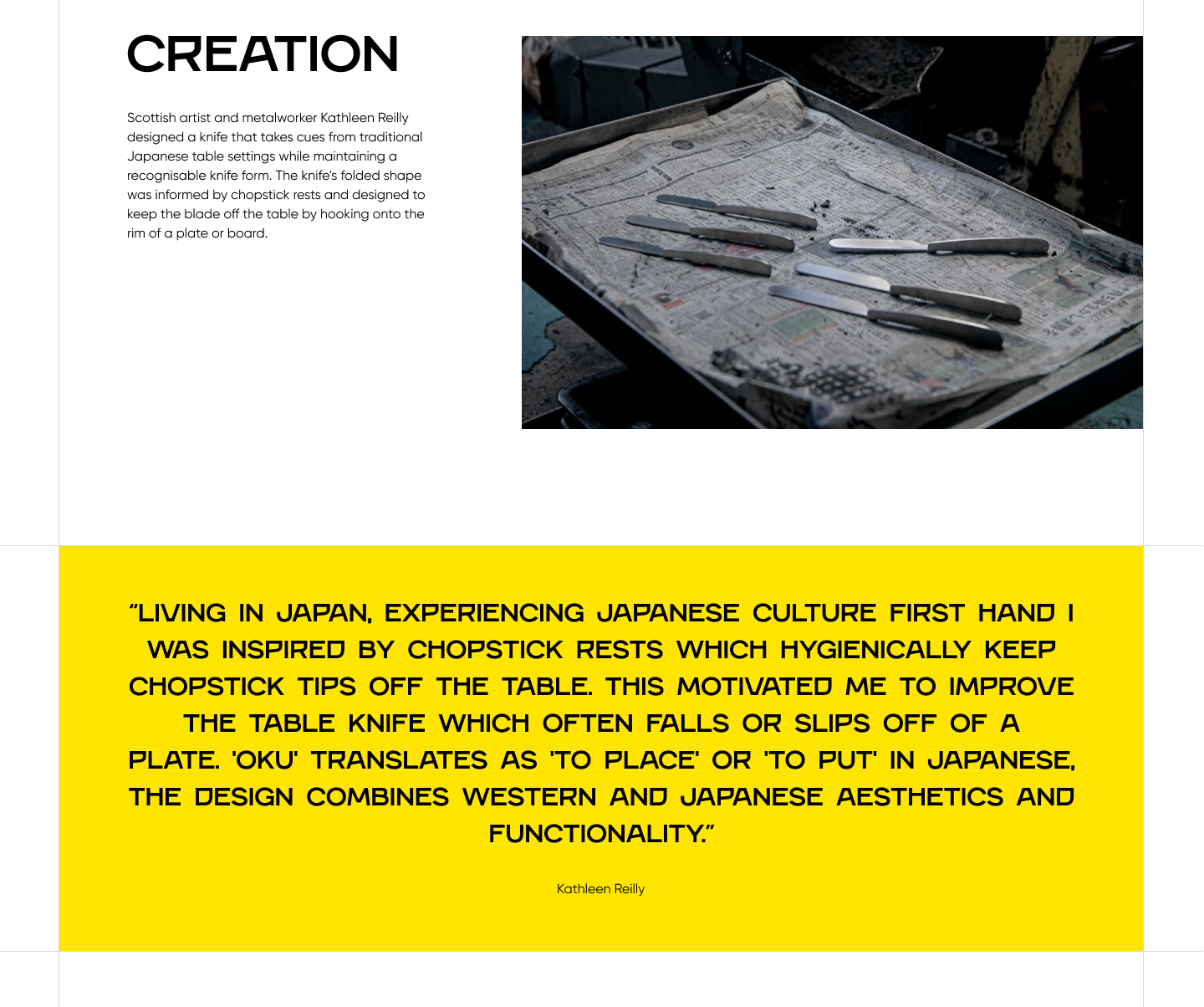
Logo that reads Lera Serheichyk in a playful, slightly irregular font. Logo that reads Lera Serheichyk in a playful, slightly irregular font.

Oku case study

Landing page for Oku, a butter knife brand.

Design

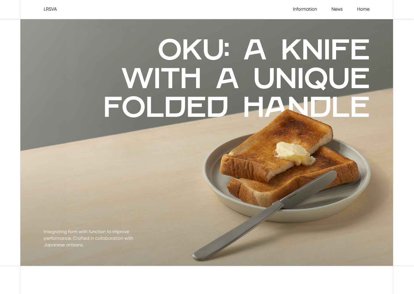
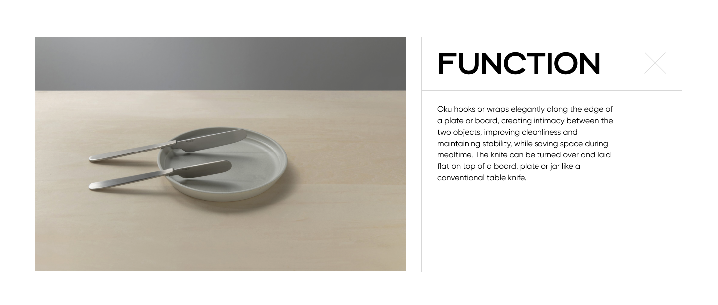
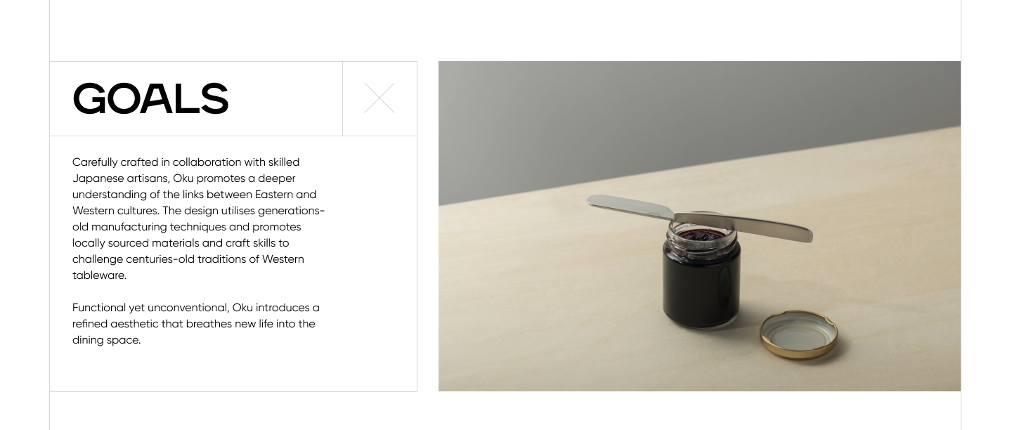
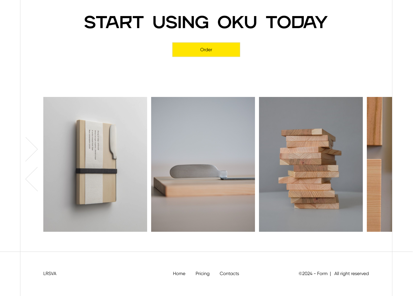
The design approach is driven by the core behaviour of the OKU knife — elevation from the surface. Every visual decision translates this physical interaction into a digital form.

Rather than treating the website as a neutral container, the layout actively reflects how the object exists in space: lifted, balanced, and intentional. This ensures the interface communicates not just what the product is, but how it behaves.

A screenshot that reads: Oku: a knife with a unique folded handle. Integrating form with function to improve performance. Crafted in collaboration with Japanese artisans. A screenshot that reads: Creation. Scottish artist and metalworker Kathleen Reilly designed a knife that takes cues from traditional Japanese table settings while maintaining a recognisable knife form. The knife's folded shape was informed by chopstick rests and designed to keep the blade off the table by hooking onto the rim of a plate or board. Living in Japan, experiencing Japanese culture first hand I was inspired by chopstick rests which hygienically keep chopstick tips off the table. This motivated me to improve the table knife which often falls or slips off of a plate. 'Oku' translates as 'to place' or 'to put' in Japanese, the design combines Western and Japanese aesthetics and functionality. Kathleen Reilly. A screenshot that reads: Function. Oku hooks or wraps elegantly along the edge of a plate or board, creating intimacy between the two objects, improving cleanliness and maintaining stability, while saving space during mealtime. The knife can be turned over and laid flat on top of a board, plate or jar like a conventional table knife. A screenshot that reads: The board. Oku's board is made from sustainably sourced Japanese wood by Karimoku Furniture, Japan's leading wooden furniture manufacturer in both quality and technology. Karimoku is committed to providing sustainable solutions while demonstrating the skill and artistry of its craftspeople. The boards incorporate domestic wood that is underutilised in furniture making. Each board is unique, made of strips expertly cut and assembled to recreate a natural wood grain pattern. Oku's editions allow you to enjoy the qualities and properties of Japan's tree species, expressing the beauty of the forests. Functional yet unconventional, Oku introduces a refined aesthetic that breathes new life into the dining space, added designer. 01. Japanese Sakura. The beauty and transience of Sakura (cherry blossoms) have been loved by Japanese people throughout history, with many handcrafted items made from the Sakura tree's wood and bark. Sakura is a hardwood, which makes it durable, smooth to the touch, with a moderate weight. You can enjoy how the wood changes colour over time as you use it. 02. Sawara Cypress. Sawara is a softwood similar to Hinoki. In Japan, this wood has traditionally been used for rice storage boxes and ladles because it is rich in natural antibacterial oils, resistant to moisture, and durable. Compared to Hinoki, it emits almost no fragrance but is softer. 03. Hinoki Cypress. Hinoki has a pleasant aroma. It is a strong and lustrous wood used widely in Japan since ancient times for everything from bathtubs to temples. In addition to its natural antibacterial properties, it is water resistant, just like Sawara. A screenshot that reads: Goals. Carefully crafted in collaboration with skilled Japanese artisans, Oku promotes a deeper understanding of the links between Eastern and Western cultures. The design utilises generations-old manufacturing techniques and promotes locally sourced materials and craft skills to challenge centuries-old traditions of Western tableware. Functional yet unconventional, Oku introduces a refined aesthetic that breathes new life into the dining space.  Japanese kitchenweare. A screenshot that reads: Press and comments. 01. Reilly aimed to create a reinterpretation of the western table knife that interacts with tableware in different ways while maintaining a recognisable knife form. Dezeen. 02. Simplicity, craft and poetry meet in Oku - a butter knife with a perpendicular blade that slots neatly into the edge of a wooden board, all lyrically wrapped in a poem. Anthology. 03. The Oku knife features a rather intriguing handle that is folded 90 degrees from its blade - the handle can be placed on a surface, with the blade sitting perpendicularly away from that particular surface. Yanko. A screenshot that reads: Start using Oku today.

Layout

The layout uses asymmetry and edge-alignment to mirror the knife’s relationship with surfaces. Content is deliberately offset and anchored to edges, referencing the way the folded handle hooks onto a table.

Generous negative space is introduced to simulate the “air gap” created when the knife is elevated. This creates a sense of lightness while directing focus toward the product form.

Spacing is used as a functional tool rather than purely aesthetic. This creates a calm, considered rhythm that aligns with the influence of Japanese dining rituals, where placement and spacing carry meaning.

Typography

The typography system is designed to reflect the dual nature of the OKU knife, whic is expressive in form, yet precise in function.

Angry is used for headings to introduce a sense of character and distinctiveness. Its sharp, assertive forms echo the sculptural quality of the knife and its unconventional folded handle. This creates a visual tension that reflects the product’s challenge to traditional tableware norms.

In contrast, Gilroy is used for body text to ensure clarity and readability. Its clean, geometric structure provides a neutral foundation, allowing the more expressive display type to stand out without overwhelming the layout.